When you think about creating a website, what are the first things that pop to mind? For many, these would include web hosting, builder choices, and similar ones. Before thinking about content and social media links, though, you should also consider your website layouts - in other words, what your site is going to look like.
Admittedly, while it’s not really a huge priority when you’re just starting out and looking at how to create an actual website with a builder or a CMS, it’s still something that should be on your mind, nonetheless. It takes 0,05 seconds for a user to decide whether or not they like your website[1] - 0,05 seconds!
I probably don’t need to tell you this, but your website layout design plays a huge part in this decisionmaking process.
In this article, we’ll discuss some general things to keep in mind when thinking about your website layouts, and I’ll also give you a few examples of site that have done it right, too.
Do you have any tips for those building a website by themselves?
The best advice for those building their website is to know at the outset how much time you want to spend learning and working on your site. This will help you determine the best website builder for you. Do lots of research, something easy to use will be less customizable, but you will save time. Website builders that are very customizable will give you more room to grow your site and make it unique but will take more time to learn.
Table of Contents
- 1. Why are Website Layouts Important?
- 2. General Rules of Thumb Concerning Website Layouts
- 2.1. 1. The “F” Pattern
- 2.2. 2. Simplicity is Key
- 2.3. 3. Section Placement is Important
- 3. Real-Life Website Layout Examples
- 3.1. 1. Amazon
- 3.2. 2. Squarespace
- 3.3. 3. Bethesda
- 3.4. 4. Wikipedia
- 3.5. 5. Forbes
- 4. The Best Website Builders for a Top-Tier Website Layout
- 5. Conclusions
Why are Website Layouts Important?
To begin talking about website layouts and web layouts ideas, we should probably address the main question right away - why should anyone be looking to use the best website layouts on their platforms?
In other words, why are website layouts even important, in the first place?
For starters, refer to the statistical data mentioned in the introductory part of the article - if your user makes up their mind about your site in 5 milliseconds, there’s little room for error to be had.
The layout of your site isn’t even going to “add” to the visitor’s experience - frankly, it’s going to make up the bigger part of it.

Now, you might be inclined to think that things like images, text box sizes and their locations are among the leading culprits when it comes to the visitor liking or disliking your site - to an extent, that’s true. That said, if all of those things are placed randomly throughout the page, well… That doesn’t really make things better, now does it?
Initial reactions aside, website layouts are also important simply because of the overall user experience. This includes everything from more-trivial matters such as “eye-candy” images, up to the user actually being able to find the information that they are looking for in an easy manner.
Finally, the layout of your website, whether you want it or not, conveys a certain message about your brand. To have a better understanding of what I mean, you can just visit one of the more popular websites on the web, such as Facebook or Amazon - they have very distinct layouts, and are immediately recognizable.
General Rules of Thumb Concerning Website Layouts
As with any other element in your site creation process, crafting high-end website layouts can be a pretty daunting task. Having said that, though, there are some general rules of thumb that you could follow, and that will help you generate some unique web layouts ideas.
1. The “F” Pattern
When researching website layouts and what’s the best way to go about creating one of your own, you might encounter a term “‘F’ pattern”.
To be frank, it’s a great rule to follow both when thinking about website layout ideas, and also about the location (also - formatting) of your content in the specific layout of your choice.

The “F” pattern refers to our natural eye movement (attention) pattern when we visit a website and read some information on it. Following this specific pattern, you can optimize the content on your page so that the “attention points” display only the most relevant information, and also some calls to action.
Naturally, the “F” pattern will also influence the website layouts that you might choose to employ on your site. Truth be told, a huge number of the best website layouts utilize this pattern!
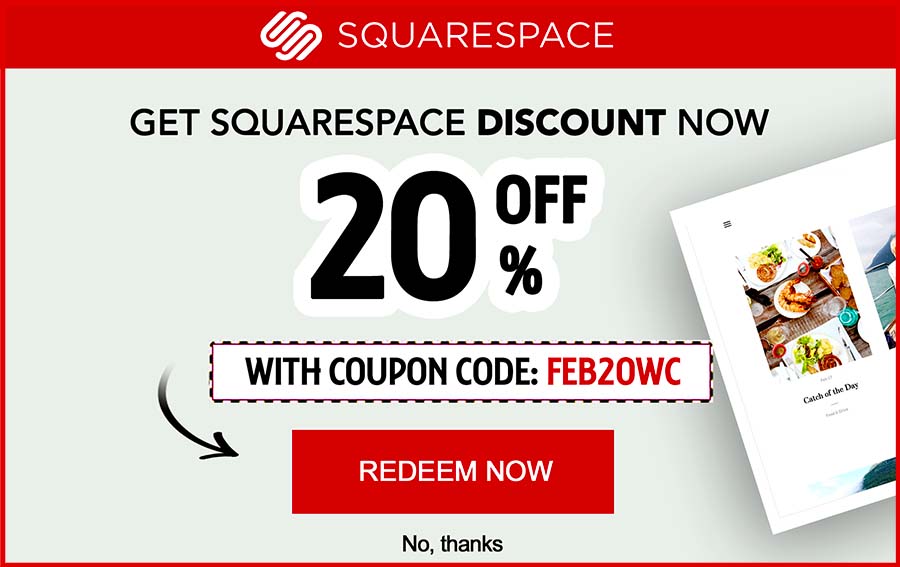
Latest Squarespace Coupon Found:
SAVE 20%
Squarespace Limited-Time Deal
Grab this Squarespace offer code & enjoy a lovely 20% off on any selected Squarespace subscription plan. Create your dream website NOW!
2. Simplicity is Key
Nowadays, it’s rather common to encounter sites that have super-intricate layouts. These could range from everything from video-based intros and interactive, flashy menu options, all the way to some state-of-the-art drop-down menus and alternative scrollable windows.
All of that is fine and dandy - really, the more unique your site is, the more memorable it will be to the user, too. There is but one, single rule that you should always keep in mind, though - simplicity is always something that you employ on your site.

How does simplicity fit into some elaborate, modern website layouts, you may ask? Well, it’s actually quite simple (yes, I did that in purpose), really - most people are used to a specific site pattern. Meaning, you kind of expect the main menu to be at the top of the page, the search bar to be located top-right or in the middle, and so on.
If you were to refer to the website layout design best practices, you’d do well to keep things that way, too.
Imagine visiting a site that has the main menu all the way at the bottom of the page, or which menus are created in a way that they only pop up if some specific conditions are met. Needless to say, that’s a nuisance, to put it lightly.
3. Section Placement is Important
Now, you might think that this is something that’s quite obvious, but alas - that’s often not the case.
No matter what type of a site it is that you’re trying to create, and whether it’s an eCommerce-based platform or not, the location of your specific sections should always be carefully chosen.
Do keep in mind, though, that’s I’m not talking about the visual aspect of the matter - the sections can surely be intricate and interactive! Instead, when thinking about section placement in your website layouts, you should focus on providing your site visitors with the maximum amount of useful information and inner-links straight from the get-go.

What does this mean? Basically, if you’re currently running a sale and have a banner made that promotes that sale, it should probably be located at the top of the homepage, and also be clickable, too, so that it could direct the user into the actual sale section of your site.
Can you catch my drift?
A high-quality website layout design will have sections integrated into it rather seamlessly. Admittedly, this can prove to be a rather complex task - that’s why professional web designers are so sought after, after all!
Real-Life Website Layout Examples
Now that we’ve covered some of the main “rules of thumb” to follow when thinking about web layouts ideas, let’s move on and take a look at some real-life examples of what we’ve talked about above.

Did you know?
Have you ever wondered which website builders are the best for your business?
See & compare TOP website builders side by side1. Amazon

As noted earlier on in the tutorial, Amazon has done a great job with their website layout. That’s because of two big reasons - it’s very recognizable, and also user-friendly.
The recognition aspect stems from a combination of the color scheme and the actual layout of the site. The representative black-blue menu at the top of the page, combined with the font of the menu items invoke an undeniable response of “yup, I’m definitely at Amazon!”.
The layout is simplistic in nature, but works very well with Amazon’s business model. While the brand has an impressively-extensive list of menu items for the customer to browse through, they are all tucked away in the sidebars, so that they wouldn’t scare the customer upon first visiting the site.
As far as website layout ideas go, Amazon does a great job of integrating some news and other advertisements into the auto-scrollable horizontal section in the middle of the homepage. It’s a pretty popular design, and it works very well.
2. Squarespace

While it may seem somewhat ironic to include a website builder company’s homepage layout into this article, Squarespace is a perfect example of one of the currently-popular website layouts - that which utilizes a full-sized photo in the background of the front page.
While this sort of design probably won’t give you any new website layout ideas at first glance, Squarespace does an amazing job of making the image blend into the overall layout of the site. Furthermore, that same image does also serve a purpose to market the brand’s product - a website builder. Very clever!
Squarespace utilizes a minimalistic approach when it comes to the general layout of the page - there aren’t all that many options to explore. Having said that, the options that ARE there have been integrated in creative and clever ways - a great example!
3. Bethesda

Bethesda is one of the most renowned game development companies in the entire world.
Visting the company’s homepage, you are immediately greeted by their currently-relevant content. As of writing this article, that would be the Fallout series.
The interesting thing about Bethesda’s layout is that it’s basically designed in a way that would both promote the company’s current product, and also provide visitors with useful information surrounding other news, as well.
Scrolling through the page, it’s obvious that Bethesda utilizes different sections for the different types of content that’s available on their site. The brand avoids flashy features, and instead focused on concentrating as much relevant information on the front page as possible.
4. Wikipedia

While Wikipedia is a site that most of us visit quite frequently, it’s seldom that people would pay attention to the website layouts that are visible on this site.
Concentrating on the front page, though, it offers an unusual radial menu design. Not only is it unique, but also catches the attention of the user!
Since Wikipedia is most commonly used in order to look up some pieces of information, the search bar is right at the center of the page. The website also features a sterile, simple and welcoming design.
5. Forbes

Forbes is the perfect example of website layout ideas that are aimed at news-related websites, but still promote a clean and organized site design.
Upon visiting Forbes, you could see that - to an extent - the website utilizes the “F” pattern. This is evident when scrolling down the front page - while it’s dominated by images, the textual data is short, concise and to-the-point, while also being concentrated in specific section of the website.
At the top of that page, Forbes has a simple, yet self-evident list of topics that you can browse by using the drop-down menu. A clean way to house a lot of different articles!
The Best Website Builders for a Top-Tier Website Layout
With some examples of great website layouts given, on a final note, it’s worth mentioning some website builders that are going to provide you with the means of creating and utilizing modern and unique layouts on your own site.
| SQUARESPACE | SHOPIFY | WORDPRESS | |
| Most suitable for great visuals | Most suitable for ecommerce | Most suitable for blogging | |
| All Squarespace Coupons | See All Coupons of Best Website Builders | See All Coupons of Best Website Builders | |
| A great website builder for both individuals and small business alike. | Amazing tools and functionality for your online store. | While WordPress isn't easy to learn at first, it's an extremely rewarding platform in the long run. | |
|
Visit site
Read review |
Visit site
Read review |
See TOP10 Brands
Read review |
|---|
Table: Squarespace, Shopify and WordPress.com
While the builders mentioned below are some of the leading options, there are other ones to check out, too - remember that it all depends on the type of website that you’re aiming to create, and the sort of layout that you’re looking at using.
- Squarespace. Squarespace offers modern and sleek templates, all of which are optimized for both mobile and desktop use. Each template will come with different website layouts, all of which are customizable to a certain extent. Squarespace’s plan prices start at $12 per month.
- Zyro. If you want some great eCommerce functionality and modern website layouts and templates, Zyro shouldn't leave you disappointed. An all-around well-made builder, Zyro's prices start at $1,30 per month - a bargain!
- Shopify. If you’re looking to create an eCommerce platform, there’s frankly no better builder than Shopify to help you with the task at hand. Not only is it super-simple to use, but the builder also has some amazing template and layout choices for you to pick - all of which are optimized for your eCommerce needs. Prices start at $29 per month.
- WordPress. While the builder option of WordPress is decent, if you want complete freedom with your website layouts and their management, you should look into using WordPress.org. With a bit of know-how and some decent WP plugins, you’ll be able to create any site layout that you can imagine. On top of that, it’s completely free to use - all you need to do is find a website hosting provider.
Conclusions
With that, you should now be more knowledgeable when it comes to different website layouts, and the processes that go into creating the best layouts for your own, specific website needs.
Do check out our list of the industry-leading website builders, and - whether you pick Zyro, Squarespace, or WordPress.org - I wish you good luck in creating the best website layouts that you can!
Contributed by: Andrew Mallonee , Founder of Mallonee Media
Andrew is a senior specialist application engineer and the founder of Mallonee Media - web development and creative agency taking a slightly different approach to helping clients. They cater to peo...
Read Full Bio...Scientific References
✓ Fact Checked
| contributed by: Andrew Mallonee
, Founder of Mallonee Media
1. Gitte Lindgaard Gary Fernandes Cathy Dudek & J. Brown: 'Attention web designers: You have 50 milliseconds to make a good first impression!'
Leave your honest feedback
Leave your genuine opinion & help thousands of people to choose the best website builder. All feedback, either positive or negative, are accepted as long as they’re honest. We do not publish biased feedback or spam. So if you want to share your experience, opinion or give advice - the scene is yours!


